相似字体

作者说明

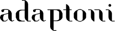
Adaptoni, designed by Rui Batista of FSI FontShop International GmbH, is a free high-contrast serif with broad, sculpted curves and razor-thin joins. Its broken strokes give the letters a crisp, cut-paper quality.

Packaging can use that mix of elegance and interruption to suggest a fashion-led or experimental product. The same sharply edited forms suit magazine covers, cultural posters, and music artwork. Their stencil-like gaps are especially apt for projects built around collage, modernist graphics, or fragmented imagery.
标签

字符映射表

使用下拉菜单查看此字体包含的不同字符映射表。
基本拉丁字母 - 字符映射表

字体基本信息

版权注意
Copyright rui batista 2010
字体系
adaptoni
字体次系
Regular
独立次系身份
FontStruct adaptoni
全字体名称
adaptoni Regular
名字目录版
Version 1.0
页面描述语言字体名称
adaptoni
注册商标注意
FontStruct is a trademark of FSI FontShop International GmbH
制造商名字
http://fontstruct.fontshop.com
设计师
rui batista
描述
adaptoni was built with FontStruct

字体扩展信息

支持的平台

平台编码
统一字符编码2.0及以上字符编码型,只有BMP统一字符编码
微软只有BMP统一字符编码

字体详情

创建日期2010-06-16
版本1
字形数量175
每em单位数1024
嵌入权限允许预览和打印的嵌入
字体家族分类自由衬线
字重中等(常规)
字宽中等(常规)
Mac样式粗体
方向只限从左到右的字符+包含中立
图案属性