Ari-W9500 Regular
TrueType字体GNU通用公共许可证
- 口音 (局部的)
- 口音 (全部)
- 欧元
ari-w9500.ttf
标签
作者注
Ari-W9500 font is a unique pixelated typeface by Catterio Sylt. This condensed bitmap font embodies a retro, digital aesthetic reminiscent of early computer graphics yet gives off a futuristic impression. It seamlessly combines geometric patterns and pixel perfection to give you an instantly recognizable outcome that remains memorable even in passive situations.
Take advantage of the free techno display font and bring video games, online avatars, blogs, comic books, movie covers, magazines headings and articles, branding projects including logotypes or business cards to life with it. Mainly headlines are what this geometric typeface is expected to excel at!
--
For more information, please visit the homepage of the font:
https://fontstruct.com/fontstructions/show/2368522/ari-w9500
字符地图
请使用下来菜单观看包含该字体的不同字符地图

基本字体信息
版权注意
Copyright Catterio Sylt 2023
字体系
Ari-W9500
字体次系
Regular
独立次系身份
Ari-W9500
全字体名称
Ari-W9500 Regular
名字目录版
Version 1.0
页面描述语言字体名称
Ari-W9500
注册商标注意
FontStruct is a trademark of FontStruct.com
制造商名字
设计师
描述
“Ari-W9500” was built with FontStruct
Designer description: Presenting... Ari-W9500 - a complete pixel font family with multiple weights & styles.
This is basically pixelated Arial. Nothing interesting, really. The font is heavily inspired by the pixelated font used in Microsoft's Windows 95. The project was originally meant to be an improved and revamped version of the popular W95FA pixel font.
With more than 1600 glyphs, the font can support a wide range of languages (primarily supports Latin, Greek and Cyrillic).
The alternative glyphs of all the font styles included in the family are stored in the "Braille Patterns" Unicode block.
=================================
Extra context:
For those who are wondering, Ari-W9500 began under construction BEFORE Rogue was even planned. After done publishing Rogue, I just wanted to finish this project up and move on.
=================================
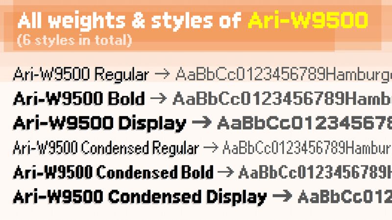
The entirety of the Ari-W9500 font family (6 styles):
• Ari-W9500 Regular
• Ari-W9500 Bold
• Ari-W9500 Display (Extra-bold)
• Ari-W9500 Condensed Regular
• Ari-W9500 Condensed Bold
• Ari-W9500 Condensed Display
=================================
Future plans:
Looking forward to adding Hebrew support soon.
Due to technical difficulties, I WILL NOT be making italic versions for the styles.
=================================
If you see any glyphs in the font that's incorrectly designed, please tell me by commenting.
Feel free to clone the project and add additional language support (e.g.: CJK, Thai, Arabic, Devanagari) as you wish.
=================================
Honorable mention FOR VIETNAMESE USERS: (PLEASE READ)
For the Vietnamese users who try to type Vietnamese using this font, I apologize for compromising the diacritical marks to the point of illegible (especially in the display/extra-bold weight). I get the fact that stacked Vietnamese diacritical marks are supposed to be recognizable and easy to read. I mean, I myself am a local Vietnamese and know how it works. But, I have to except the fact that pixel fonts have limitations. Trying to keep the Em Height properly and NOT expanding it is hard, keeping the stacked diacritical marks' height in that small amount of horizontal space is even harder. To make the job even possible, legibility MUST be sacrificed. Otherwise, the Em Height would be ruined and the horizontal space of the font would look unreasonably large. I hope you locals do not get too mad over this. I am just trying to make it as good and legible as possible.
=================================
Thanks for enjoying this moment with me. Happy (early) Lunar New Year.
Designer description: Presenting... Ari-W9500 - a complete pixel font family with multiple weights & styles.
This is basically pixelated Arial. Nothing interesting, really. The font is heavily inspired by the pixelated font used in Microsoft's Windows 95. The project was originally meant to be an improved and revamped version of the popular W95FA pixel font.
With more than 1600 glyphs, the font can support a wide range of languages (primarily supports Latin, Greek and Cyrillic).
The alternative glyphs of all the font styles included in the family are stored in the "Braille Patterns" Unicode block.
=================================
Extra context:
For those who are wondering, Ari-W9500 began under construction BEFORE Rogue was even planned. After done publishing Rogue, I just wanted to finish this project up and move on.
=================================
The entirety of the Ari-W9500 font family (6 styles):
• Ari-W9500 Regular
• Ari-W9500 Bold
• Ari-W9500 Display (Extra-bold)
• Ari-W9500 Condensed Regular
• Ari-W9500 Condensed Bold
• Ari-W9500 Condensed Display
=================================
Future plans:
Looking forward to adding Hebrew support soon.
Due to technical difficulties, I WILL NOT be making italic versions for the styles.
=================================
If you see any glyphs in the font that's incorrectly designed, please tell me by commenting.
Feel free to clone the project and add additional language support (e.g.: CJK, Thai, Arabic, Devanagari) as you wish.
=================================
Honorable mention FOR VIETNAMESE USERS: (PLEASE READ)
For the Vietnamese users who try to type Vietnamese using this font, I apologize for compromising the diacritical marks to the point of illegible (especially in the display/extra-bold weight). I get the fact that stacked Vietnamese diacritical marks are supposed to be recognizable and easy to read. I mean, I myself am a local Vietnamese and know how it works. But, I have to except the fact that pixel fonts have limitations. Trying to keep the Em Height properly and NOT expanding it is hard, keeping the stacked diacritical marks' height in that small amount of horizontal space is even harder. To make the job even possible, legibility MUST be sacrificed. Otherwise, the Em Height would be ruined and the horizontal space of the font would look unreasonably large. I hope you locals do not get too mad over this. I am just trying to make it as good and legible as possible.
=================================
Thanks for enjoying this moment with me. Happy (early) Lunar New Year.
扩展字体信息
平台支持
平台编码
统一字符编码2.0及以上字符编码型,只有BMP统一字符编码
微软只有BMP统一字符编码
字体细节
创建2024-02-06
修订1
字符计数1641
单位每Em2048
嵌入权利允许预览和打印的嵌入
字体族类型无归类
重量中等轻
宽度压缩
Mac 风格粗体
方向只限从左到右的字符+包含中立
图案性质常
完整文件包含6字体重列出如下:
ari-w9500.ttf
ari-w9500-condensed-display.ttf
ari-w9500-condensed.ttf
ari-w9500-condensed-bold.ttf
ari-w9500-bold.ttf
ari-w9500-display.ttf
ari-w9500-condensed-display.ttf
ari-w9500-condensed.ttf
ari-w9500-condensed-bold.ttf
ari-w9500-bold.ttf
ari-w9500-display.ttf
Ari-W9500 Condensed Display Regular
TrueType字体GNU通用公共许可证
Ari-W9500 Condensed Regular
TrueType字体GNU通用公共许可证
Ari-W9500 Condensed Bold Regular
TrueType字体GNU通用公共许可证
Ari-W9500 Bold Regular
TrueType字体GNU通用公共许可证
Ari-W9500 Display Regular
TrueType字体GNU通用公共许可证