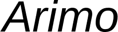
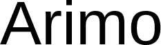
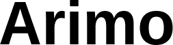
Arimo Italic is a free italic sans serif with a brisk forward slant and balanced, moderately broad proportions. Its clean strokes vary gently in width, giving the capitals a firm profile and the lowercase letters a less mechanical flow.
Magazine publishing is a natural setting for it, especially in feature introductions and pull quotes, where the slant can quietly signal emphasis without ornament. It also suits corporate presentations and web graphics, though editorial emphasis is its most convincing role.
Digitized data copyright (c) 2010 Google Corporation.
字体系
Arimo
字体次系
Italic
独立次系身份
Ascender - Arimo Italic
全字体名称
Arimo Italic
名字目录版
Version 1.10
页面描述语言字体名称
Arimo-Italic
注册商标注意
Arimo is a trademark of Google and may be registered in certain jurisdictions.
制造商名字
Ascender Corporation
设计师
Steve Matteson
描述
Arimo was designed by Steve Matteson as an innovative, refreshing sans serif design that is metrically compatible with Arial". Arimo offers improved on-screen readability characteristics and the pan-European WGL character set and solves the needs of developers looking for width-compatible fonts to address document portability across platforms.