Balgruf
OpenType字体GNU通用公共许可证
- 口音 (局部的)
- 口音 (全部)
- 欧元
Balgruf.otf
标签
作者注
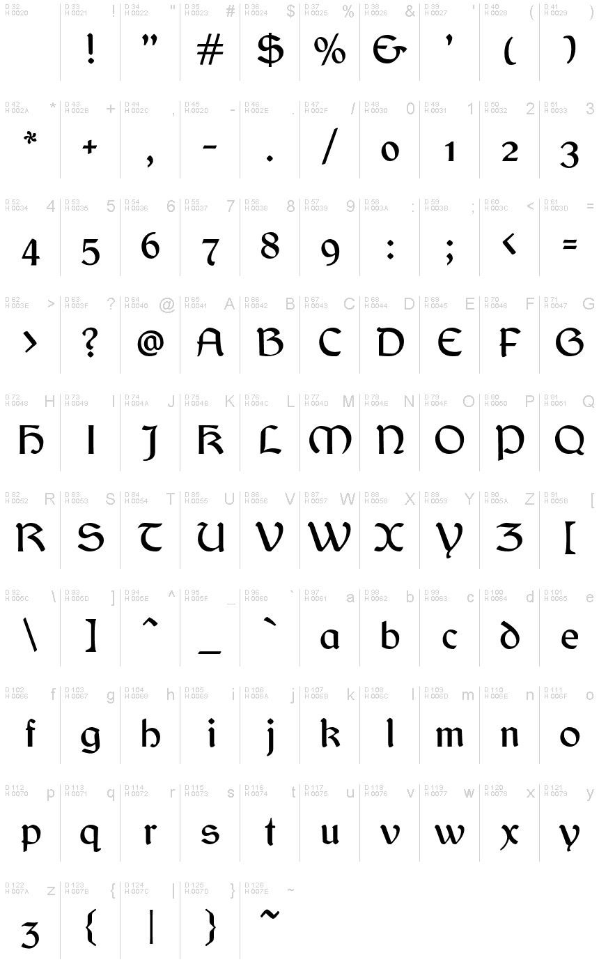
Looking for a font that will add a touch of medieval mystery to your project? Look no further than Balgruf, designed by the masterful Paul Miller. With its gothic typeface and celtic style, this semi-bold font is perfect for adding an air of intrigue to any design. Whether you're creating a logo for a fantasy-themed business or designing invitations for a Renaissance fair, Balgruf will help your text stand out in a truly unique way. So why settle for boring standard fonts when you can embrace the dark beauty of Balgruf?
This is a font inspired by the game 'Skyrim', if you have ever played Skyrim and read any of the books there you may have noticed that the upper case 'F' looks out of place and has a very large right side bearing. It looks like a graphic designer with no typographical experience was given the job of making an F on a very tight deadline and this is what he/she came up with. It seems to be cobbled together from pieces of other characters in the font cut up and glued together.
Once you see this mistake you cannot unsee it. As a type designer I thought I could have done better. So the question arose, how would I have done it. This font is the answer to that question.
Enjoy!
字符地图
请使用下来菜单观看包含该字体的不同字符地图

基本字体信息
版权注意
Copyright (c) Paul James Miller, 2020. All rights reserved.
字体系
Balgruf
字体次系
Regular
独立次系身份
Balgruf:Version 1.201
全字体名称
Balgruf
名字目录版
Version 1.201;March 28, 2021;FontCreator 13.0.0.2683 64-bit
页面描述语言字体名称
Balgruf
制造商名字
设计师
描述
As a typographer playing Skyrim by Bethesda I was annoyed by the font used in the books. The upper case 'F' seemed to have been cobbled together from other bits of the font and didn't fit with the aesthetic of the rest of the letters in the font, it also had a right side bearing which was much too large.
As if it had been hastily made by a graphic designer with no experience in typography who was on a strict deadline.
Once you 'see' this mistake you cannot unsee it and it was annoying.
So the question arose, how would I have done it?
This font is the answer to that question.
Enjoy !
As if it had been hastily made by a graphic designer with no experience in typography who was on a strict deadline.
Once you 'see' this mistake you cannot unsee it and it was annoying.
So the question arose, how would I have done it?
This font is the answer to that question.
Enjoy !
扩展字体信息
平台支持
平台编码
统一字符编码2.0及以上字符编码型,只有BMP统一字符编码
苹果电脑罗马
微软只有BMP统一字符编码
字体细节
创建2020-10-23
修订1
字符计数453
单位每Em2048
嵌入权利永久安装的嵌入
字体族类型无归类
重量中等(常规)
宽度中等(常规)
Mac 风格粗体
方向只限从左到右的字符+包含中立
图案性质常
峰无间隔
完整文件包含2字体重列出如下:
Balgruf.otf
Balgruf_Italic.otf
Balgruf_Italic.otf
Balgruf Italic
OpenType字体GNU通用公共许可证