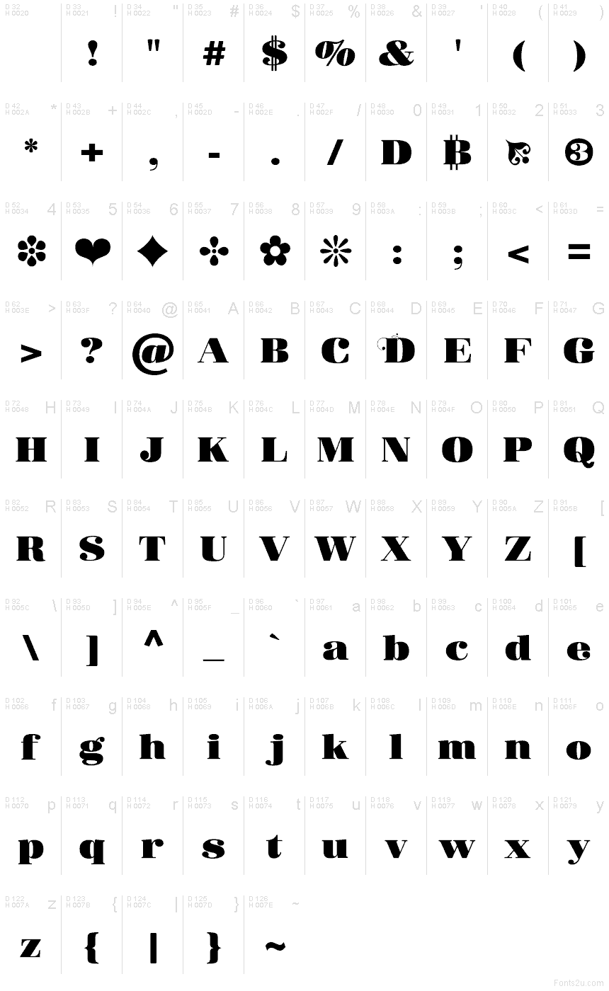
Donaire Black
TrueType字体私人使用
- 口音 (局部的)
- 欧元
Donaire-Black-FFP.ttf
标签
作者注
Donaire Black font by Fernando Haro is a flamboyant and elegant expanded serif with vintage-inspired and ornamental features. This free expressive style is achieved by using softened organics, edgy terminals, curves, inner counters, and refined serifs. The visual contrast between thin strokes and thick ones enhances the dramatic flair.
The extravagant display typeface achieves clear legibility in large text sizes used on branding projects like packaging boxes and labels. Book covers are another place to use it whether they’re mystery books or fantasy stories. Other relevant uses: movie titles, magazines’ headings, posters, invitations/cards (wedding/anniversary).
--
字符地图
请使用下来菜单观看包含该字体的不同字符地图

基本字体信息
版权注意
Copyright (c) 2025 by deFharo. All rights reserved.
字体系
Donaire Black
字体次系
Regular
独立次系身份
Version 2.510;DFHA;Donaire-Black;2025;FL842
全字体名称
Donaire Black
名字目录版
Version 2.510
页面描述语言字体名称
Donaire-Black
注册商标注意
Donaire is a trademark of deFharo.
制造商名字
设计师
描述
Donaire is my current interpretation of the classic Didonas, a modern Didona that pays homage to the elegant fat-face fonts that emerged in the late 18th century.
Inspired by modernist and historical aesthetics, I designed Donaire to capture the essence of those typefaces.
Donaire combines the visual power of thick vertical strokes and thin horizontal strokes, accompanied by the delicacy of transitional serifs and droplet endings, achieving a perfect balance between legibility and visual impact.
扩展字体信息
平台支持
平台编码
统一字符编码2.0及以上字符编码型,只有BMP统一字符编码
苹果电脑罗马
微软只有BMP统一字符编码
字体细节
创建2025-05-12
修订2
字符计数230
单位每Em1000
嵌入权利限制嵌入(不允许!)
字体族类型无归类
重量极粗
宽度伸展
Mac 风格粗体
方向只限从左到右的字符+包含中立
图案性质常
峰无间隔