Garota Sans Bold
TrueType字体私人使用
- 口音 (局部的)
- 欧元
GarotaSans-Bold-FFP.ttf
标签
作者注
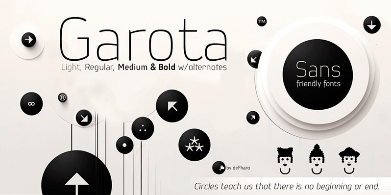
Garota Sans Bold font is a sans serif typeface designed by Fernando Haro of deFharo. A bold, geometric, and minimalist style summarizes the simple and versatile appearance of the presented font. Featured are thick bodies, smooth edges, functional shapes, and modernist influence shapes with an organic touch. All these properties allow the font’s ease of readability all while maintaining a professional presence.
As a free font, Garota Sans Bold would give great results when used on headings, sub-headings or even in smaller paragraphs combined with proper line-height. Try it on magazines’ featured articles, websites/blog posts headings sections either for personal or business purposes. Shop corners can use it for signages in additions to branding identity boards that either belong to corporate businesses or newly emerging startups seeking fresh ideas for growth development.
--
As a free font, Garota Sans Bold would give great results when used on headings, sub-headings or even in smaller paragraphs combined with proper line-height. Try it on magazines’ featured articles, websites/blog posts headings sections either for personal or business purposes. Shop corners can use it for signages in additions to branding identity boards that either belong to corporate businesses or newly emerging startups seeking fresh ideas for growth development.
--
字符地图
请使用下来菜单观看包含该字体的不同字符地图

基本字体信息
版权注意
Copyright (c) deFharo, 2024. All rights reserved.
字体系
Garota Sans
字体次系
Bold
独立次系身份
Version 1.234;DFHA;GarotaSans-Bold;2024;FL830
全字体名称
Garota Sans Bold
名字目录版
Version 1.234
页面描述语言字体名称
GarotaSans-Bold
注册商标注意
Garota Sans is a trademark of Fernando Haro
制造商名字
设计师
描述
Garota Sans is distinguished by its slightly narrow proportions and generous metrics. Every detail has been carefully adjusted to ensure a smooth and clear reading experience. The kerning has been meticulously configured, providing space and a consistent, easy-to-follow reading rhythm, which is essential for both long texts and impactful headlines.
The typeface family consists of 12 fonts distributed across four weights (Light, Regular, Medium, and Bold) and three styles (Roman, Italic, and Small Caps). This versatility allows for its use in a wide range of applications, from editorial and advertising projects to posters, magazines, or videos.
The typeface family consists of 12 fonts distributed across four weights (Light, Regular, Medium, and Bold) and three styles (Roman, Italic, and Small Caps). This versatility allows for its use in a wide range of applications, from editorial and advertising projects to posters, magazines, or videos.
扩展字体信息
平台支持
平台编码
统一字符编码2.0及以上字符编码型,只有BMP统一字符编码
苹果电脑罗马
微软只有BMP统一字符编码
字体细节
创建2024-07-31
修订1
字符计数232
单位每Em1000
嵌入权利限制嵌入(不允许!)
字体族类型无衬线
重量中等粗
宽度中等(常规)
Mac 风格斜体
方向只限从左到右的字符+包含中立
图案性质常
峰无间隔
完整文件包含4字体重列出如下:
GarotaSans-Bold-FFP.ttf
GarotaSans-BoldItalic-FFP.ttf
GarotaSans-Italic-FFP.otf
GarotaSans-Regular-FFP.ttf
GarotaSans-BoldItalic-FFP.ttf
GarotaSans-Italic-FFP.otf
GarotaSans-Regular-FFP.ttf
Garota Sans Bold Italic
TrueType字体私人使用
Garota Sans Italic
OpenType字体私人使用
Garota Sans Regular
TrueType字体私人使用