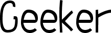
由 Meir Sadan 设计的 Geeker Thin 是一款免费的漫画风格显示字体,它在保持个性的同时减少了混乱感。其线条纤细且略带抖动,给人一种手绘和人性化的感觉,但字母本身依然保持直立整齐,因此即使在较小的字号下也清晰易读。这是一种亲切且充满极客气息的手写体,就像你在整洁的笔记本上看到的那样——随性,但在屏幕上却异常整洁易读。
This font is an English version of the "Yoav" font, which you can view on my hebrew site. It's one of my best fonts and it's definately my favorite. I like it because it really has a constant shape and feel. I still don't like the hand-drawn motif, though. I'd like to create a typeface sometime that doesn't look like it's been drawn. This would probably involve *not* drawing it by hand, but I'll get to that sometime in the near future, I think.
Am I a geek? I think so. After all - I *am* a computer major in high-school, I wear glasses and I like doing things on the Internet and stuff like that. I bet all of the above is sufficiant to make me a qualified geek times seven. I hope you like the font, though.