Geoplace SC Regular
TrueType字体私人使用
- 口音 (局部的)
- 欧元
GeoplaceSC-Regular.ttf
标签
作者注
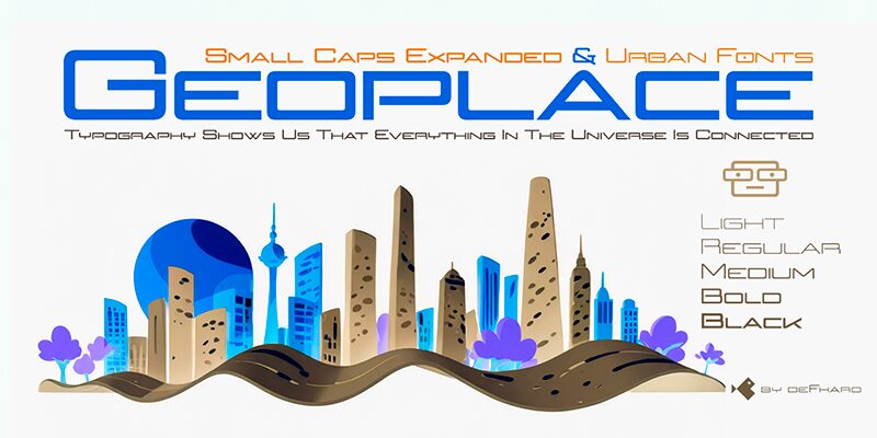
Geoplace SC, crafted by Fernando Haro of deFharo, stands out with its distinct futuristic aesthetic. This display font is characterized by its light weight and expanded width, giving it an airy yet bold presence. The sleek, geometric shapes and clean lines make Geoplace SC a perfect choice for any modern design context.
Ideal for tech-oriented projects, contemporary branding, or sci-fi themes, Geoplace SC’s unique style enhances readability while maintaining a striking visual appeal. Its versatility allows it to fit seamlessly into various creative endeavors, from digital interfaces to print media.
Ideal for tech-oriented projects, contemporary branding, or sci-fi themes, Geoplace SC’s unique style enhances readability while maintaining a striking visual appeal. Its versatility allows it to fit seamlessly into various creative endeavors, from digital interfaces to print media.
字符地图
请使用下来菜单观看包含该字体的不同字符地图

基本字体信息
版权注意
Copyright (c) 2024 by deFharo. All rights reserved.
字体系
Geoplace SC
字体次系
Regular
独立次系身份
Version 2.236;DFHA;GeoplaceSC-Regular;2024;FL821
全字体名称
Geoplace SC Regular
名字目录版
Version 2.236
页面描述语言字体名称
GeoplaceSC-Regular
注册商标注意
Geoplace Small Caps is a trademark of deFharo.
制造商名字
设计师
描述
Geoplace Small Caps: An expanded proportion sans serif typeface family, imbued with futuristic urban style and technological inspiration, reflecting my passion for design and geometric precision to achieve unique aesthetics and exceptional legibility.
扩展字体信息
平台支持
平台编码
统一字符编码2.0及以上字符编码型,只有BMP统一字符编码
苹果电脑罗马
微软只有BMP统一字符编码
字体细节
创建2024-03-05
修订2
字符计数233
单位每Em1000
嵌入权利限制嵌入(不允许!)
字体族类型无归类
重量特轻
宽度加强伸展
Mac 风格粗体
方向只限从左到右的字符+包含中立
图案性质常
峰无间隔
完整文件包含4字体重列出如下:
GeoplaceSC-Regular.ttf
Geoplace-Regular.ttf
Geoplace-Bold.ttf
GeoplaceSC-Bold.ttf
Geoplace-Regular.ttf
Geoplace-Bold.ttf
GeoplaceSC-Bold.ttf
Geoplace Regular
TrueType字体私人使用
Geoplace Bold
TrueType字体私人使用
Geoplace SC Bold
TrueType字体私人使用