Kaput Black
TrueType字体私人使用
- 口音 (局部的)
- 欧元
Kaput-Black-FFP.ttf
标签
作者注
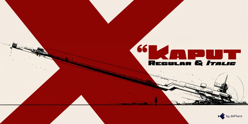
Kaput Black, a unique, heavy uppercase typeface, is here to create great titles and high-impact visual communication.
Kaput Black is designed with a perfect balance between strength and sophistication, it is bold, semi-expanded and spectacularly legible, the thick lines and horns with marked contrasts, which not only catch the eye, but also provide real harmony, thanks to the meticulous work of metrics and kerning.
Available in Regular and Italic versions with a 20-degree tilt that adds dynamism, modernity and technology.
=========================
DOWNLOAD FULL VERSIONS & LICENSES: https://defharo.com/fonts/kaput/
=========================
字符地图
请使用下来菜单观看包含该字体的不同字符地图

基本字体信息
版权注意
Copyright (c) 2024 by deFharo. All rights reserved.
字体系
Kaput Black Black
字体次系
Regular
独立次系身份
Version 2.244;DFHA;KaputBlack;2024;FL842
全字体名称
Kaput Black
名字目录版
Version 2.244
页面描述语言字体名称
KaputBlack
注册商标注意
Kaput Black is a trademark of deFharo.
制造商名字
设计师
描述
Kaput Black, a heavy and unique uppercase typeface family, is here to revolutionize the way we conceive great titles and high-impact visual communication.
Kaput is designed with a perfect balance between strength and sophistication, it is bold, semi-expanded and spectacularly legible, the thick lines and horns with marked contrasts, not only capture attention, but also provide meticulous harmony, thanks also to a thorough work on metrics and kerning.
Available in Black and Black Italic versions, the 20-degree inclination of the italic version adds a touch of dynamism and modernity.
扩展字体信息
平台支持
平台编码
统一字符编码2.0及以上字符编码型,只有BMP统一字符编码
苹果电脑罗马
微软只有BMP统一字符编码
字体细节
创建2024-11-24
修订2
字符计数243
单位每Em1000
嵌入权利限制嵌入(不允许!)
字体族类型无衬线
重量极粗
宽度加强伸展
Mac 风格粗体
方向只限从左到右的字符+包含中立
图案性质常
峰无间隔