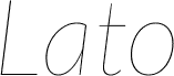
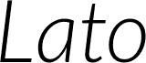
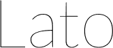
Lato by Lukasz Dziedzic is a free humanist sans serif with clean, quietly distinctive proportions. Broad capitals sit comfortably beside a generous lowercase, and the strokes shift subtly in width rather than appearing rigidly geometric. Its rounded forms feel composed and approachable.
The restrained shapes suit captions and supporting text around photography in corporate reports, editorial spreads, and public-information graphics, since they do not impose a period style. The same clear, contemporary manner also suits app interfaces and understated product packaging.
--
The ending makes effective use of its contemporary style.
Copyright (c) 2010 by tyPoland Lukasz Dziedzic with Reserved Font Name "Lato". Licensed under the SIL Open Font License, Version 1.1.
字体系
Lato
字体次系
Regular
独立次系身份
tyPoland LukaszDziedzic: Lato Regular: 2010
全字体名称
Lato Regular
名字目录版
Version 1.010; Western character set
页面描述语言字体名称
Lato-Regular
注册商标注意
Lato is a trademark of tyPoland Lukasz Dziedzic.
制造商名字
tyPoland Lukasz Dziedzic
设计师
Lukasz Dziedzic
描述
Lato is a sanserif typeface family designed in the Summer 2010 by Warsaw-based designer Lukasz Dziedzic ("Lato" means "Summer" in Polish). It tries to carefully balance some potentially conflicting priorities: it should seem quite "transparent" when used in body text but would display some original traits when used in larger sizes. The classical proportions, particularly visible in the uppercase, give the letterforms familiar harmony and elegance. At the same time, its sleek sanserif look makes evident the fact that Lato was designed in 2010, even though it does not follow any current trend. The semi-rounded details of the letters give Lato a feeling of warmth, while the strong structure provides stability and seriousness.