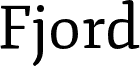
Napo is a striking slab serif typeface that commands attention. Designed by Isabella Ahmadzadeh, this versatile font boasts a harmonious blend of tradition and modernity. Its robust, geometric forms exude a sense of authority, while the soft, rounded terminals lend a touch of approachability. Napo's four weights and accompanying italics offer ample flexibility, allowing it to excel in both display and body copy applications. Complemented by its companion sans-serif, Leon, this comprehensive type family covers over forty languages, making it a suitable choice for a diverse range of design projects.
The font's distinctive personality and broad language support make Napo a compelling option for designers seeking a captivating, yet functional typeface. Its striking aesthetic lends itself well to branding, editorial design, and attention-grabbing headlines, while the versatile nature of the family ensures seamless integration into various design contexts.
This trial font is TOTALLY FREE for PERSONAL AND COMMERCIAL USES.
Download the full version and the whole family at
http://zetafonts.com/napo
Have a question?:
info@zetafonts.com