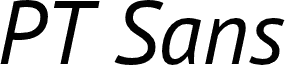
PT Sans Caption by A. Korolkova, O. Umpeleva, and V. Yefimov of ParaType Ltd is a free humanist sans serif with broad, open letterforms. Its strokes are firm but not mechanical, with gentle curves and subtly changing widths. The generous proportions give the lettering a calm, practical look.
Its understated modernist style fits publishing and public information, where a direct, matter-of-fact voice is useful. Institutional branding can use the same clear silhouettes for a steady, professional voice. It is particularly convincing for cultural and educational projects, whose informative purpose matches the lettering's approachable restraint.
PT Sans is a type family of universal use. It consists of 8 styles: regular and bold weights with corresponding italics form a standard computer font family; two narrow styles (regular and bold) are intended for documents that require tight set; two caption styles (regular and bold) are for texts of small point sizes. The design combines traditional conservative appearance with modern trends of humanistic sans serif and characterized by enhanced legibility. These features beside conventional use in business applications and printed stuff made the fonts quite useable for direction and guide signs, schemes, screens of information kiosks and other objects of urban visual communications.
The fonts next to standard Latin and Cyrillic character sets contain signs of title languages of the national republics of Russian Federation and support the most of the languages of neighboring countries. The fonts were developed and released by ParaType in 2009 with financial support from Federal Agency of Print and Mass Communications of Russian Federation. Design - Alexandra Korolkova with assistance of Olga Umpeleva and supervision of Vladimir Yefimov.