作者说明
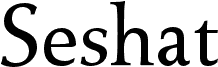
Seshat is a free high-contrast serif font with broad proportions, fine pointed serifs, and dramatic changes between sturdy verticals and hairline strokes. The broad letters look poised rather than severe.
It can establish a refined editorial voice in magazine mastheads and literary covers, where the generous forms suit serious subjects and traditional publishing. Cultural institutions and premium packaging can use the same stately drawing for exhibition names, section titles, and product identities. Beside classical portraiture, engraved illustrations, or archival photography, its fine strokes and grand curves echo historic print lettering and become part of the image rather than a neutral caption.
标签