版权注意
Copyright (C) 1998 Meir Sadan <meir@sadan.com>
字体系
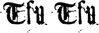
Tfu Tfu
字体次系
Regular
独立次系身份
Meir Sadan Tfu Tfu
全字体名称
Tfu Tfu
名字目录版
Version 1.50
页面描述语言字体名称
TfuTfu
制造商名字
Meir Sadan
设计师
Meir Sadan
描述
My kitty can make fonts. One day I
was hanging around with my lovely
kitty-cat, browsing different types
of fonts. My kitty surprisingly
started to stare at each typeface, examining
its typographical correctness and structure,
the serifs and the stroke angle. Suddenly,
she meowed.
It wasn't the regular kind of meow - it was
her special meow. The meow she uses to
greet people she likes... At that moment, it
just hit my mind - my kitty happens to like
Goudy's typeface.
Goudy is that font on the cover of The New
York Times... The one that says "The New
York Times". Yeah. Anyways... My kitty
seemed to get all giddy and stuff, so I made
a printout of it and let my kitty play with it.
In a very extreme measure of carefulness,
she started toodling around with the font -
scrach here, scratch there - wrinkle here,
wrinkle there.
She started to get bored from this routine
quite fastly, so I took the poor piece of paper
and rolled it to the shape of the ball. You
should've seen the look of graditude on her
face when she found out she could now both
play and make a font at the same time!
To make a long story short, I eventually took
the wad of material previously known as a
piece of paper and scanned it into a font. And
now you can have it. So there.