We The People
TrueType字体私人使用
- 口音 (局部的)
- 口音 (全部)
- 欧元
WeThePeople.ttf
标签
作者注
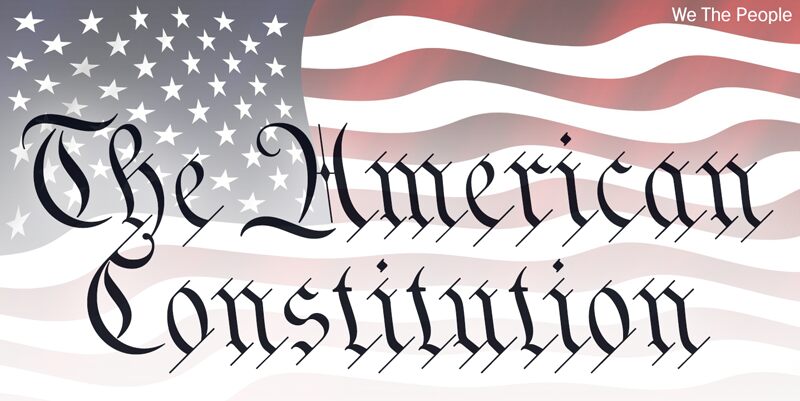
This typeface is extrapolated from the We the People calligraphy of the handwritten US Constitution Preamble which employed a style based on German Text and Square Text exemplars from George Bickhams penmanship copy-books, the most celebrated being 'The Universal Penman' published in 1743.
The original Constitution document was transcribed onto parchment by Jacob Shallus, a Pennsylvania Assistant Clerk, over a weekend in 1787. Shalluss biographer, Arthur Plotnik ('The Man Behind the Quill', 1987), notes that he was paid $30, a modest monthly wage at the time. He also suggests that the calligraphic headings, We the People and Article, may have been inserted by Shalluss 14 year old trainee son, Francis,
The manner in which the Article headings are squeezed into the space Shallus allowed for them suggests a second handand perhaps not a very experienced one.
The unconventional backslant of the headings would seem to support this contention, and at the end of the document there is perhaps a novices inconsistency in the structure of the letter n between that used for done and those used for In Witness. However, one has to admire the elegant swagger of the wavy t, h and l which the K-Type font extends to the b, f and k. Also, the simpler, Schwabacher-style W, an enlarged version of the lowercase w, is a little less flamboyant than the capital W from the German and Square texts in Bickhams manuals.
For designers using OpenType-aware applications, the typeface includes some Alternates, including a Bickham-style W, the letters t, h and n with added flourishes, two simpler forms of the A, and a few roman numerals for numbering articles. Also some ornamental flourishes and a round middle dot/decimal point. Punctuation marks are drawn in square, calligraphic style, but an alternative round period/full stop, for use with currency and numerals, is available at the period centered position (though placed on the baseline), accessed by Shift Option 9 on a Mac, or Alt 0183 on Windows. The full phrase, We the People, has been placed at the trademark keystroke and can be accessed by Shift Option 2 on a Mac, or Alt 0153 on Windows.
For designers who find the backslant awkward or unpleasant, the licensed typeface is available from k-type.com and includes two additional fonts which have a vertical aspect that may be more conducive to graphic design layouts. We The People Upright and We The People Upright Bold both retain the distinctive style, and the heavier weight is only slightly emboldened, just enough to add some punch.
The original, backslanted We The People font is free for personal use, and can be used freely by students and teachers at schools, colleges and universities, and by educational institutions themselves. The free font can also be used without licensing by public charities, museums, and libraries.
字符地图
请使用下来菜单观看包含该字体的不同字符地图

基本字体信息
版权注意
We The People by Keith Bates • © 2021 www.k-type.com • This font is extrapolated from the We the People calligraphy of the handwritten US Constitution Preamble.
字体系
We The People
字体次系
Regular
独立次系身份
pyrs: We The People: 2021
全字体名称
We The People
名字目录版
We The People version 1.0 by Keith Bates • © 2021 www.k-type.com
页面描述语言字体名称
WeThePeople
制造商名字
设计师
Keith Bates
描述
The ‘We The People’ font is free for personal use. It can also be used unlicensed by students and teachers at schools, colleges and universities, by educational institutions themselves, and by public charities, museums, and libraries.
扩展字体信息
平台支持
平台编码
统一字符编码2.0及以上字符编码型,只有BMP统一字符编码
苹果电脑罗马
微软只有BMP统一字符编码
字体细节
创建2021-01-20
修订1
字符计数404
单位每Em1000
嵌入权利永久安装的嵌入
字体族类型字迹
重量中等轻
宽度中等(常规)
Mac 风格粗体
方向只限从左到右的字符+包含中立
图案性质斜体的
峰无间隔